Before You Print Bigger: A Realistic Upscaled Image Workflow
A practical checklist for preparing upscaled photos for print and design output while controlling artifacts and expectations.
Print has a different gravity than screen. A file that looks okay in a browser can still look disappointing in a framed print, especially if it starts from a small or noisy source.
In this guide, we will build a practical path for creators and small businesses preparing bigger physical outputs with upscaled images, while avoiding the trap of “more pixels means better print no matter what.” They are cousins, but one does not always solve the other.
Start with size and viewing distance
For print, ask one simple pair of questions before scaling: where will people view this print, and from how far? A poster watched from a meter away tolerates different texture than a business card held in hand. This changes how far you push pixel detail.
Official print workflows often begin with high ppi targets for fine detail, then tune for distance and viewing purpose. In practical terms, upscaling from a weak source will not create genuine micro-detail, it only redistributes what is already there. So clean source work stays number one.
Clean before you enlarge
For old photos, low-light scans, or compressed uploads, the first pass should be cleanup, then resize. If your source has compression blocks, sensor noise, or color shifts, scaling first usually magnifies those flaws. It is often easier to restore confidence first, then scale for print size.
Use a gentle denoise pass, check color consistency, and compare against a neutral reference. If skin tones, fabric textures, or sky gradients shift strangely after cleanup, reduce intensity. A minor texture variation looks natural; a banded gradient does not.
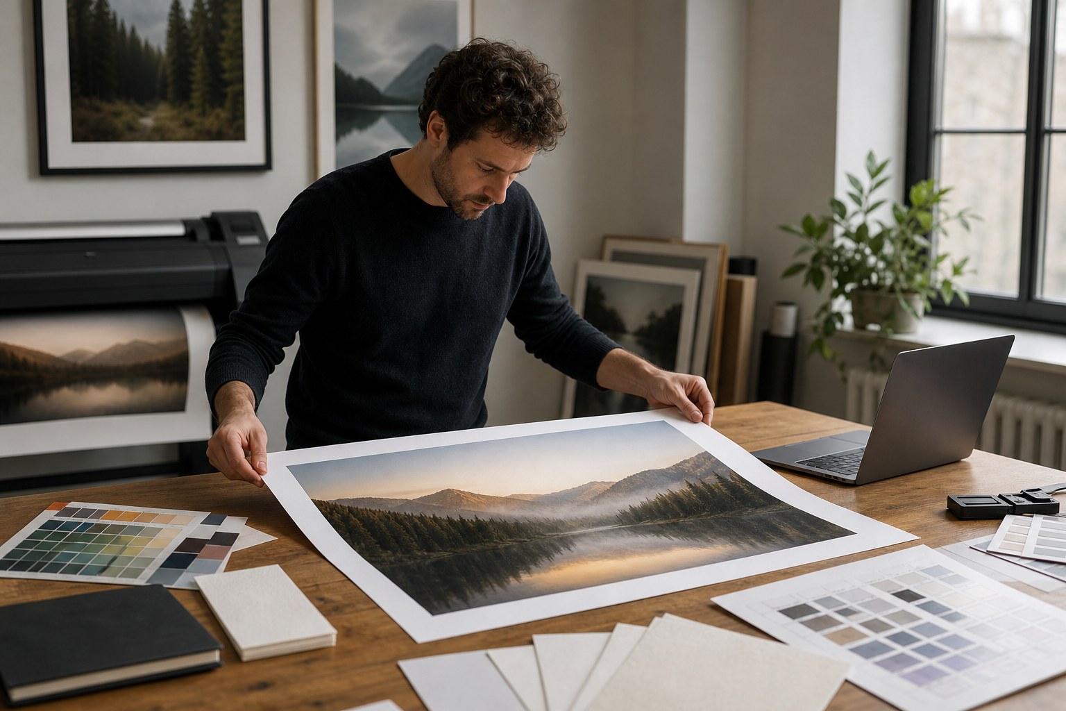
Choose the right destination and paper strategy
If the output is a signed flyer for a booth, you may not need the same strictness as a framed artwork print. Likewise, packaging inserts can be more forgiving than premium wall print. Treat each destination as a separate goal.
Here is a lightweight preflight checklist:
- What is the final physical dimension in inches?
- How will the image be viewed (distance and angle)?
- Is there text or logos near the edge?
- What is the acceptable finish time and cost per revision?
- Will this print be used with gloss, matte, or metallic paper?
If one answer points to high scrutiny, use the careful 2x or 3x route. If all answers are forgiving, 2x is often enough, and you can avoid over-processing.
When to stop scaling and reshoot
If restoration artifacts remain even after careful cleanup, do not force an additional upscale cycle. Sometimes the cleanest workflow is to re-capture the source at higher quality if possible. No tool can invent information from underexposed noise, and customers notice when they do.
Upscaled prints should feel intentional, not magical. The winning move is predictable quality, then honest limits. A slight softness accepted by design is still better than an aggressively sharpened fake edge that screams “filter.”
Proofing your prints before final output
Digital previews often hide issues that only appear in ink and paper. Ask for a first proof where colors and contrast are checked in grayscale and full color. Grayscale proofs are amazing for spotting contrast drift, while full-color checks catch channel bias and saturation jumps.
Keep a log for each proof run with settings and outcomes. If a second proof requires the same change twice, include it in a saved profile. If another requires different settings, isolate what changed in paper, ink, or lighting.
Print quality checkpoints that prevent surprises
Use these checks before you click print at final size: verify that the canvas has the expected target dimension, confirm that near-white areas stay clean, and confirm the first pass does not show unexpected banding in skies or walls. Print previews can exaggerate contrast loss that is hard to see on screen.
Most teams also discover one hidden problem here: the same image can look perfect on one paper surface and a little muddy on another. If your vendor uses two finishes, ask for both test strips before full-size output.
Batching for predictable print prep
Once you get one reliable pipeline, batch your design tasks by print family: quick proof runs first, then signed outputs, then final art runs. This prevents emergency revisions during a busy launch. You will also discover at what point increased scaling no longer improves outcome, and that is usually when file quality has already reached visual sufficiency.
That stop point is valuable. It protects you from trying to “win” against physics and teaches teams to focus on consistency, color decisions, and realistic source capture.
Recovery mindset for old archives
For old family photos or legacy event shots, define one restoration goal before you begin: color nostalgia, facial detail, or print size. Trying to hit all three at once invites disappointment. Pick the goal that matches your use case, then stop when that goal is met.
When in doubt, smaller output with better restraint often performs better than a giant, artificial-looking enlargement. Your printed piece should invite people to feel, not inspect every pixel and wonder why it looks digital.
Final thought: print is not the end of the story. It is a different viewing context. Treat it with its own settings, and the upscaled image will have a much stronger chance of feeling real in someone’s hand.