
Make a Landing Page Crop Map Before You Upload an Upscaled Hero
Plan your desktop hero, mobile crop, card image, and social preview before one beautiful upscaled file turns into four awkward page problems.
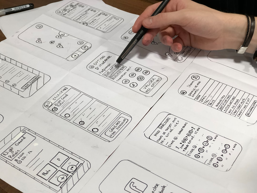
An upscaled hero image can feel like the finish line. The file opens, the details look cleaner, and somebody in the room says, "Great, upload that one." That is usually where a perfectly good image starts getting into trouble.
A landing page does not use an image in one place. The same photo might appear as a wide desktop hero, a tighter mobile hero, a small feature card, a blog preview, and a social share image. Each placement crops differently. Each one has a different job. If you upload the largest upscaled file everywhere and hope the browser, CMS, or social platform figures it out, you can end up with a slow page and a weird crop at the same time. Impressive, but not in the way anyone wanted.
The better move is simple: treat the upscaled file as your master, then make a small crop map before the image goes live. A crop map is just a plain plan for where the image will appear, what size each version should be, and what part of the image must stay visible. It sounds fancier than it is. If you can sketch boxes on a sticky note, you can make one.
Start with the master, but do not ship the master everywhere
Upscale gives you a cleaner, larger version of the image you started with. That file is valuable. Keep it. Archive it. Use it as the source for future edits. But the master is rarely the best file to serve directly on every page.
A master file is meant to preserve quality. A delivery file is meant to fit a real use. Those are different jobs. The master can stay large because it is your clean source. The delivery files should be sized, cropped, named, compressed, and formatted for the places people will actually see them.
This distinction saves a lot of small headaches. You can change a card crop without damaging the master. You can make a mobile version that keeps the product, face, room, or artwork centered. You can create a lighter desktop hero without guessing later which file was the original. Future-you will appreciate this, especially if future-you is already late for lunch.
Make the crop map before opening the CMS
Before uploading anything, list the image placements on the landing page. For many small business pages, a useful starting set looks like this:
- Archive master: the full-quality upscaled file, kept out of public page delivery unless there is a special reason to use it.
- Desktop hero: a wide crop for the top of the page, usually focused on the main subject with enough breathing room for layout.
- Mobile hero: a narrower crop that still makes sense when the screen is tall and small.
- Card or section image: a smaller version for feature blocks, service cards, product grids, or related content.
- Social preview: a separate crop where the main subject survives when platforms trim the edges.
Do this planning while looking at the actual page design, not while staring only at the image. A bakery photo that looks perfect as a wide desktop hero might lose the cupcake tower on mobile if the important detail sits too far left. A consultant headshot can work beautifully on a landing page but feel uncomfortably close in a square preview. A case-study screenshot might need a clean thumbnail crop that shows one readable area instead of the whole interface squeezed into a postage stamp.
The crop map catches those problems while they are still easy to fix. You are choosing intentional versions, not asking one file to be a contortionist.
Pick the safe area first
Every hero image has a safe area. That is the part of the image that must stay visible for the page to make sense. It might be a product label, a person's face, the storefront sign, a finished room, or the main artwork. Find that area before you resize anything.
Once you know the safe area, make sure every crop protects it. Desktop crops can often include more scenery. Mobile crops usually need to be more decisive. Card crops may need stronger subject placement because they are small. Social previews should avoid placing the subject against the far edge, because previews can be cropped again by the platform or messaging app.
If the safe area is too close to an edge in the original, do not force the crop. Choose a different source image, create a more conservative layout, or use the photo in a smaller section instead of the hero. Upscaling improves clarity, but it cannot make a cramped composition magically generous.
Choose formats like a practical person
After the crop plan is set, choose delivery formats based on the image and your site. For many photographic landing page images, JPEG is still a dependable option. WebP or AVIF can be great when your site pipeline supports them and you have tested fallback behavior. PNG is usually better saved for transparency, flat graphics, interface captures, or images where crisp edges matter more than photo compression efficiency.
The goal is not to crown one format as the permanent champion. The goal is to avoid tossing a huge file onto the page because it looked good in the editor. Public guidance from web performance teams has long pushed the same basic idea: serve images sized for the device and context instead of sending a desktop-sized image to every phone. Google also recommends helpful filenames, alt text, and surrounding page context so people and search systems can understand images more easily. That part happens after the creative work, but it is still part of the upload job.
A simple naming pattern helps. Try something like cupcake-hero-desktop.webp, cupcake-hero-mobile.webp, cupcake-card.jpg, and cupcake-social-preview.jpg. The exact words are less important than making the family understandable. If your media library contains files named final-final-2-new-real-final.jpg, no judgment, but maybe this is the day we all heal.
Do one phone check before calling it done
The phone check is where many image plans become honest. Open the landing page on a real phone or a realistic mobile preview. Look at the hero first. Does the subject still make sense? Is the crop flattering? Is there enough room around the important detail? Does the page feel sluggish because the image is heavier than it needs to be?
Then scroll. Check the card image, section image, and any preview thumbnail. Small crops have a way of revealing problems that were invisible in a full-screen editor. Text in screenshots may become too tiny. A product may blend into the background. A face may be cropped at a strange spot. These are not upscaling failures. They are delivery decisions asking for another pass.
If your site supports responsive image markup, this is also the moment to confirm that the intended sizes are being served. If you use a CMS or page builder, check whether it generates variants automatically and whether your custom crop is actually the one being used. Automatic image handling is useful, but it still needs a sensible source and a human eye.
A quick crop map you can copy
Here is a plain version you can use before publishing a landing page image:
- Keep the original and the upscaled master in an archive folder.
- Write down each placement: desktop hero, mobile hero, card, thumbnail, social preview.
- Mark the safe area that must stay visible in every crop.
- Export only the sizes and formats your site can actually use.
- Name files so the purpose is obvious later.
- Add alt text that describes the image in the context of the page.
- Open the page on a phone and check the crop before sharing the link.
This workflow is small, but it changes the way an upscaled image behaves in the real world. Instead of one large file doing five jobs poorly, you get one clean master and a set of useful page-ready versions. The landing page stays sharper, the mobile view gets more respect, and nobody has to guess why the social preview cut off the best part of the photo.
That is the quiet win: upscaling gives you better source material, and the crop map turns that source material into images your page can actually use.