Restoring Old Photos for Memories and Print: What to Expect
A clear, practical guide to restoring older photos for family archives, framing, and print, with honest expectations about what AI upscaling can improve.
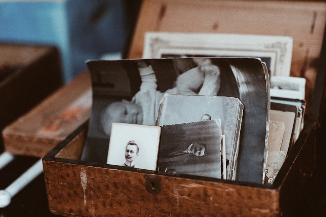
Old photos are emotional time capsules. The moment you open them, you want to see everyone again the way they remember them, not the way a compressor left them. Upscale helps, but this is one of those areas where realism matters. AI can restore detail and continuity, yet it should not be asked to invent faces or facts. That is where disappointment begins.
Let us be plain: if a photo has severe scratches, missing blocks, and heavy sensor noise, Upscale can stabilize it. It cannot restore missing memories into perfect sharpness. The smartest framing is to set expectations first, and then choose the level of restoration that protects character while improving visibility.
Step 1: Digitize cleanly before AI
Scan at the best resolution your device supports and avoid quick snapshots of the print under room light. The scanner source becomes the DNA of your result. If reflections are visible and dust is on the original, the algorithm will carry those into the final file, sometimes making them more obvious. A clean scan gives the model cleaner context.
Step 2: Stabilize global issues first
Before upscaling, make sure the whole image has reasonable tone and alignment. Strong color casts, skew, and uneven exposure can become exaggerated when expanded. A single global cleanup pass is often enough; after that, keep aggressive local edits limited. Think of this as leveling the table before putting furniture on it.
Step 3: Upscale with intent for print vs screen
For print, you generally care about visible texture and smooth faces at near-view distance. For screen-only display, comfort and legibility may matter more than microscopic texture. A restoration meant for print can be slightly different from one meant for web, even from the same source. Decide first where it will live, then tune the workflow around that goal.
Step 4: Embrace controlled restraint
If it looks too smooth, you may lose the organic feel of the original. If it looks too rough, it may feel unfinished. Many restoration jobs fail because people only see one direction as “better.” In reality, the best result sits between detail and trust. Tiny imperfections can stay; dramatic AI overconfidence can read wrong.
People do not always want a perfect photo. Most people want a true-feeling photo that still reveals what their eye misses.
Step 5: Make the first print proof your reality check
Do one small print proof and compare it to the file at screen size. Print often reveals contrast shifts and haloing earlier than your monitor. If the small print already feels believable and faces are readable, you are probably in the right place. If eyes or signatures still blur, revisit the source cleanup rather than stacking more aggressive upscale passes.
There is one more honest rule: restoration is less about perfect reconstruction and more about respectful enhancement. You are not rebuilding history; you are helping history remain visible. Upscale can be a powerful ally in that process, especially when paired with careful source prep and restrained settings.
What restoration teams get wrong most often
Most people think old photos either look "saved" or "worse." Reality is closer to dial settings. Too little correction leaves the photo unreadable, too much turns it into an invented scene. Start with the smallest correction that improves meaning: faces and text first, then background structure, and only then fine grain detail. This order keeps the result emotionally faithful.
Print adds an extra constraint. If an image looks okay on monitor but too contrasty on paper, your print profile may need a gentler conversion and slightly lower sharpening. Do not stack sharpen + denoise + contrast until everything looks good in browser windows. Physical output teaches humility, and quickly.
A good restoration workflow is therefore a dialogue with the image, not a demand. If a photo from 1998 has a few defects, keep most of its character. Add just enough restoration so the memory can be seen without turning it into a clean, anonymous file. Once that balance lands, your restoration is usually successful, even if the internet can still find better-looking examples.
Print-size choice changes everything
If a restored photo is for a 5x7 frame, do not treat it like a banner project. You need a different balance of sharpening, tone, and grain handling. Smaller prints generally benefit from slightly softer micro-details because paper blends and hides minor noise. Larger prints need cleaner lines around faces and text, but that does not mean aggressive global contrast.
Think in outcomes: “I want this print to feel calm” or “I want this scan to preserve as much family detail as possible.” Different goals need different settings even with the same original. That is why restoration is less a single tool and more a sequence of decisions. The sequence is the same as any smart workflow: understand the source, define the destination, choose restraint, and stop when the photo feels both readable and respectful.
Keep one final version for digital sharing and one tuned version for physical print. You can keep both from one clean master, and each version still carries the same memory-forward story without becoming an overworked digital artifact.