
Food Menu Photos You Can Publish Without Inventing Details
Restaurant menu photos can look sharper with smart upscaling, but prices and small text still need an honest workflow so nothing important gets distorted.
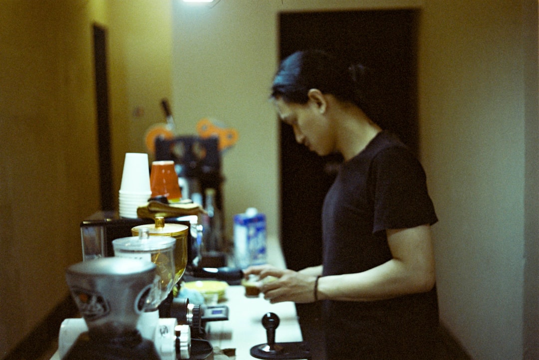
Marta ran a Friday tasting event and sent a small photo of her new dessert menu to her website team. The dish looked great in person, but the image she uploaded was soft, the tiny prices were hard to read, and one allergen note looked like a tiny stain. She could have panicked and opened a new editing app, but the safer fix was to run a short upscaling and cleanup plan first.
For restaurants, cafes, and food trucks, the goal is simple: make photos clear enough for trust, for a fast first impression. Upscaling can add usable pixels and make a blurred dish edge look cleaner, but it does not magically invent missing detail. If a menu item name is too small to read before processing, do not pretend the result is accurate after processing. In food marketing, detail quality matters. Guests care about flavor, not only smooth edges.
Before touching any slider, ask one question: is this image a candidate for upscaling, or should it be retaken? Use this short check. Keep a copy of the source. If the source is heavily compressed, too dark, badly exposed, or has missing text blocks, it may be cheaper and safer to reshoot. If the image is only slightly soft, too small, or compressed once too often, upscaling can still help.
Decide the right fix, not the biggest fix
For menu imagery, different tasks need different workflows:
- Food photos for your site hero, social posts, or menus: upscaling can improve clarity, color confidence, and texture detail.
- Printed menu snapshots and signs: upscaling can improve visibility, but always verify prices, allergens, and item names after processing.
- Screenshots or scans from old systems: reshoot or recreate the text where possible. An upscaled screenshot is often more polished, but details remain uncertain.
Many restaurant owners make this mistake. They treat every blurry photo as a candidate and then wonder why tiny text feels less trustworthy after processing. The result is often an image that looks cleaner but still not reliable for a menu page. The right goal is accuracy first, style second.
Source prep changes everything
Good input makes a better output. Start with a small cleanup pass before upscaling. This is where most future frustration disappears:
- Use the highest-resolution source you can find, not the reposted copy from a messenger app.
- Cut down noise and harsh glare in the source if possible, but avoid over-processing.
- Crop around the useful area. For menus, leave space around edges so final social or card crops do not cut off names or prices.
- Lock orientation and file naming. If your filename says menu_summer_week4_final_v2.jpg, your future audit stays sane.
A common trap is to crop text too tightly. If a menu board has a thin margin, leave it. That margin protects text alignment on narrow displays. A perfect dish shot with clipped prices is worse than a slightly wider shot with a neat border.
Choosing 2x, 3x, or 4x for restaurant assets
Higher scale is not always better. Use scale as a match for end use:
2x usually fits small social photos, profile shots, and short listing previews where file size and speed are sensitive. 3x is often useful for detailed food photography that still needs multiple responsive sizes. 4x can help when you are preparing a large hero for a hero banner or print-ad sized crop, but the larger files demand stronger quality checks.
Think in stages. Create a master upscaled source at the level you need, then derive smaller versions for each publish location. If a destination is small, do not upload a giant image directly. That causes slow load time and can still look blurry if the viewing size is too cramped.
Menus and text: protect readable truth
This is where most people get in trouble. A menu is not a decorative poster. If the text is not clear, your customer may misread a price or ingredient. That can create bad service calls, wrong expectations, and trust issues.
Use this simple rule:
- Upscale for visual clarity.
- Review all readable text blocks against the source menu or print file.
- If a word is fuzzy, keep it from the source design, not the photo engine.
- Rebuild only the text in a real design file when needed.
Short text in old photographs can be corrected by adjusting contrast and mild sharpening, but if a price was compressed into mush, do not claim recovery. Either retype the item list in your web CMS or do a fresh photo. The audience notices fewer errors than they notice extra sharpness.
Format choices for web, social, and food ads
After upscaling, keep one clean master. Then create purpose-built versions:
- Website hero and category pages: crisp photo, moderate file size, and enough width for larger layouts.
- Menu listing cards: a lighter version that loads quickly on mobile.
- Instagram and short social formats: square-friendly crops with strong focal food subjects and legible text.
JPEG is often fast and compact for photos. PNG can help with graphics and high-contrast logos. Modern formats can work where your workflow supports them. The strongest move is not the format itself; it is matching a version to the channel.
A real workflow for small business teams
Take one batch of five menu images and run this sequence:
- Run a short triage: keep, replace, or reshoot.
- Upscale each keep-worthy file with conservative settings.
- Export web and social variants from the same master.
- Proof every text block at mobile size before publishing.
- Upload with descriptive filenames and accurate alt text.
Marta used this order on her dessert menu photos. One shot that had tiny lettering still looked better after upscaling, but she chose to rebuild the text in a clean template before publishing. Two shots were reshot with better lighting. The result was clearly stronger, and it was safer for guests reading prices on phones.
The final preflight check
Before you hit publish, run a three-screen test: desktop, tablet, and mobile. Then run this honesty checklist:
- Is the main subject still believable?
- Are prices, names, and warnings readable at viewing size?
- Does the image load quickly on a typical phone signal?
- Is the filename and alt text useful for discoverability?
If anything looks uncertain, pause and correct the source before release. Guests trust a honest, crisp photo more than a technically glossy one. That is the whole point. A good restaurant image should sell appetite and confidence, not ambiguity.
Use upscaling as a steady helper, not a replacement for quality shooting. Keep your details true, especially when money and food quality are involved, and your visuals will stay useful long after the filters and campaign trends have changed.