2x, 4x, or 8x? A practical size guide for store photos that helps sellers win
Choose the right upscale ratio for ecommerce photos by destination size, detail needs, and page speed, not by habit.
Store owners hear “upscale everything to 4x” like it is a magic trick. It is not. Your product photos only need the resolution you will actually show, and sometimes a 2x or 3x setting is smarter than the biggest number on the dropdown.
Let us use a simple seller story. Maria sells handcrafted mugs. She started testing every image at 8x because her team told her bigger was better. The result looked a little sharper in the thumbnail list, but page weight ballooned, and mobile conversion dipped. Why? Because she upscaled beyond what her listing layout ever displays, and most of that extra detail was hidden in extra bytes the browser had to download.
Start with target display size, not source fantasy
First question: Where will this image actually appear?
If your card displays at 400 px wide, you do not need a final master wider than the responsive variant needed for retina screens. The difference between 2x and 4x matters, but only in the context of displayed size and crop. If the image gets shown as a small gallery square, over-upscaling usually adds processing cost, not customer value.
In practice, 2x is often your baseline for thumbnails and secondary detail shots. 4x is common for zoomable hero crops and detailed product close-ups. 8x is rarely needed for listings unless the image has to support very large print-like previews or zoom surfaces.
Build a simple matrix by destination
Pick your default ratio by channel:
- Thumbnail strips and quick grid views: 2x or native size is usually enough.
- Detail shots on desktop PDP: 4x gives better fine print without overkill.
- Large zoom galleries: 4x with a clean source usually beats 6x+.
- Hero banners with text overlays: test carefully with your exact crop, often 2x–3x.
- Print mockups or big landing visuals: 8x may be valid if original quality is high.
The key is not the ratio itself. The key is preserving texture and readability at the displayed size. A shoe tread should remain clear enough to inspect, and brand logos should remain legible, even after compression by your platform.
How compression and storage interact with ratio
Every larger ratio can increase the final file footprint. If your upload pipeline compresses again, some detail is lost no matter the quality setting. That means blindly choosing the highest ratio may create files that look impressive in one export and muddy in others. In ecommerce, this hurts user trust: details looked sharp in admin view, then became soft in storefront cards.
Keep a test workflow:
- Set one baseline source and create 2x and 4x variants.
- Upload both to your listing environment.
- Check mobile, tablet, and desktop previews side by side.
- Keep the lighter option if visual quality is equal or better.
This is practical science, not dogma. It also saves hosting budget over time.
Rule to remember on bad detail
When logos look too sharp and become fake, you used too much detail push for too little source quality. If text edges appear glowing or fuzzy in circles and corners, reduce the ratio and improve source cleanup first. Your buyers care about trust more than a technical “highest setting” badge.
The best scale setting is the smallest one that still lets customers see what they need to buy, not the largest one available.
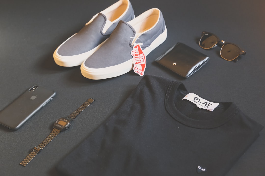
If the listing includes multiple image angles, do not make all images the same ratio by reflex. A macro shot of stitching needs more visible detail than a lifestyle shot against a room background. Treat each asset by function, and your catalog will look less random and much more intentional.
When to go bigger
8x is justified when one image has long exposure details or must support high-resolution zoom for conversion-critical areas. It is also justified when the source is already rich: high-quality RAW export, clean edges, strong contrast, and no obvious artifacting. If those conditions are not true, no ratio will save it. Start earlier in the process, and the ratio decision becomes easier.
Case example: listing page with mixed image sets
Here is a useful scenario. A seller uploads three angle types for one product: hero image at 1800 px, detail shot at 1400 px, packaging shot at 1000 px. The first round at 8x gave huge detail but also a noticeable payload jump, and mobile users waited longer before seeing the buy button. Moving to 4x for hero and detail, and 2x for packaging shot kept texture for the customer-critical views while reducing file cost. Conversion stabilized and the product stayed clean in zoomed thumbnails.
This is why context matters more than a single setting. If a template has multiple image roles, map each role to a resolution target. It takes about ten minutes to define that map and saves hours of manual one-size-fits-all cleanup.
When 8x is still a good idea
There are still reasons to use 8x. Rarely, but truly. A high-touch hero image that includes tiny engraved details or printed labels can need more canvas points to avoid blocky edges. A pre-production landing page with large zoom interactions can also justify the larger source. The trick is to reserve 8x for jobs where you can measure the benefit: detail checks, conversion tests, and clear visual inspection before upload.
If 8x is used, pair it with strict post-processing limits. Do not let everyone in the team default to it when they are not dealing with those same edge cases. That is where storage spikes and inconsistent appearance begin.