
Local Business Photos That Still Look Real After Upscaling
Older business photos can still earn their spot online when you start with the best source, keep customer-facing details truthful, and export lighter versions after upscaling.
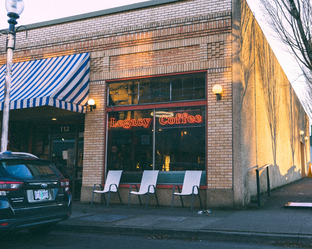
A local business photo has a harder job than people give it credit for. It has to look clean on a phone, load quickly on a website, feel trustworthy on a listing, and still resemble the actual place a customer will visit. That is a lot to ask from a picture taken three phones ago under lighting that was apparently installed by a sleepy raccoon.
Upscale can help a small, soft, or compressed photo look clearer, but the best results come from treating upscaling as one step in a careful publishing workflow. The goal is not to turn a neighborhood bakery into a marble palace or make a service van look freshly wrapped when it is not. The goal is simpler and more useful: make the real photo easier to see while keeping the business honest.
That matters for websites, booking pages, Google Business Profile photos, local ads, service pages, menus, and galleries. Customers use those images to answer practical questions. Is the shop easy to recognize from the street? Does the treatment room look clean? Can I read enough of the product label to know what I am buying? Is the portfolio photo showing the actual work or a fantasy version of it? If an upscaled image changes the answer, it needs another pass or a reshoot.
Start with the most honest source you have
Before you upload anything, hunt for the best original. That usually means the photo straight from the phone or camera, not the copy downloaded from a social media post, a screenshot from a text thread, or a tiny crop from an old flyer. Every extra round of compression removes detail. Upscaling can make edges cleaner, but it cannot reliably recover detail that was never in the file.
If you have several versions, compare them at normal size first. Choose the one where the important subject is already recognizable. A slightly dull photo with real detail is usually a better candidate than a punchy, over-filtered copy with crunchy edges. For a cafe, that might mean choosing the original pastry case photo instead of the version that already has a heavy warm filter. For a plumber, it might mean using the service truck photo where the logo is small but focused, not the zoomed-in crop where the phone number has turned into alphabet soup.
A quick source check can save a lot of frustration:
- Use the original phone or camera file when possible.
- Avoid screenshots of screenshots, especially for storefronts, menus, labels, and signs.
- Prefer focused photos over dramatic ones if the photo must represent a real product, room, or service.
- Skip images where critical text is already unreadable unless you plan to recreate that text separately as real website copy.
- Keep an untouched backup so you can return to the source if an edit goes sideways.
Clean up small problems before the upscale
Upscaling works best when the source is tidy. That does not mean you need a professional retouching session. It means fixing the boring stuff that becomes more obvious once the image is larger.
Straighten the horizon on a storefront photo. Rotate a product shelf shot so the edges do not lean. Remove duplicate copies from your folder so you do not upload the wrong one later. Adjust exposure if the photo is too dim, and correct white balance if the room looks oddly blue or yellow. Crop lightly if there is a lot of empty wall or sidewalk, but do not crop so tightly that you throw away useful pixels before asking the upscaler to help.
Be careful with sharpening and filters before upscaling. Heavy sharpening can turn compression artifacts into little halos, and those halos often become louder in the final image. A beauty filter can smooth faces or textures in a way that feels false once the photo is clearer. If the photo needs to represent a haircut, a repair, a rental room, a food item, or a handmade product, calm editing beats dramatic editing.
Use the business reality test
After upscaling, inspect the result like a customer, not like a person admiring pixels at 400 percent zoom. Ask what someone might rely on before calling, booking, visiting, or buying. Then check those parts first.
For a storefront exterior, look at the sign, door color, entrance, parking markings, neighboring landmarks, and window reflections. For a service van, check the logo, phone number, license plate area, and any badges or certifications. For a salon, look at hair color, skin texture, mirrors, chair edges, and product shelves. For a restaurant menu or pastry case, check item shapes, labels, prices, and the color of the food. For a contractor, do not let cleanup make damage look smaller or a finished project look more polished than it was.
The rule is plain: if a detail would affect a customer's decision, it has to stay truthful. Better clarity is fine. Fake clarity is trouble wearing a nice jacket.
Know when upscaling is not the right fix
Some photos are worth saving. Some are worth reshooting. A dim but focused team photo might be a good candidate because the people are recognizable and the goal is a cleaner website image. A photo of a menu board where half the prices are unreadable is riskier. If the text matters, the better fix may be to type the menu into the page as real text and use the photo as atmosphere, or take a new photo with better lighting.
Reshooting is usually better when the source is extremely blurry, the subject is too small in the frame, a key product detail is hidden, colors are wildly wrong, or the image needs to prove a condition. That last one matters for repair work, real estate, medical-adjacent services, restoration portfolios, and any before photo where people need an accurate record. Upscaling can make a photo more viewable, but it should not become a witness with a creative writing habit.
Make one master, then export for each destination
Once you have a clean upscaled version, keep it as your master. Do not upload that same large file everywhere by default. Bigger images can look great in your folder and still slow down a page if you drop them straight into a website builder. A master file is your working copy. The public version should match the job.
For a website hero image, export a size that fits the design rather than the maximum size available. For a gallery thumbnail, make a smaller version that stays sharp without wasting bandwidth. For Google Business Profile, follow the current photo guidance for file type, size, focus, lighting, and realistic representation. For marketplace or directory listings, check the destination's minimum dimensions and file size limits before you upload. Different platforms ask for different things, and they do not care that your master file has been lifting weights.
For many real-world photos, JPEG or WebP is a sensible final format. PNG is useful for graphics, transparency, or cases where flat colors and sharp edges matter. AVIF can be efficient when your site supports it well, but it is still smart to think about fallbacks and your actual publishing system. The important habit is to export deliberately instead of assuming the largest file is the best file.
Use filenames and alt text like a human
When the photo is ready, give it a filename you will understand later. A name like main-street-bakery-storefront.jpg is more useful than IMG_4827-final-final-reallyfinal.jpg, a file that sounds like it has seen things. Descriptive filenames also help teams avoid uploading the wrong version when a site has several similar images.
Alt text should describe the image in plain language when the image adds meaning to the page. For a service page, that might be 'Technician standing beside a branded service van outside a customer's home.' For a cafe gallery, it might be 'Fresh pastries displayed in the bakery case near the front counter.' Do not stuff it with keywords, and do not use alt text to make claims the image does not support. If the image is decorative, your site may handle it differently, but meaningful business photos deserve clear descriptions.
A quick example workflow
Imagine a small bakery refreshing its website. The owner has a storefront photo, a pastry case photo, and a team picture from a busy Saturday morning. The storefront shot is a little soft but straight and recognizable, so it is a good candidate. The pastry case photo is dim, but the labels and food are clear enough to inspect after upscaling. The team photo is cheerful, but one person's face is motion-blurred, so that one may need a reshoot instead of a rescue mission.
The owner starts with the original phone files, keeps backups, lightly fixes exposure, and upscales the two best candidates. Afterward, they check the sign, pastry colors, labels, faces, and room details. Then they save a master copy, export a smaller website version, choose a descriptive filename, and write simple alt text. Nothing magical happened. That is the point. The photos look better because the workflow respected the real business.
Keep the photo useful, not theatrical
Local business images do not need to look like national ad campaigns to work. They need to be clear, current, and believable. A slightly imperfect photo that accurately shows your shop, product, room, or team often builds more trust than an over-polished image that makes customers wonder what is real.
Use Upscale when a good photo needs more clarity. Start with the best source, clean it gently, inspect the details customers rely on, and export versions that fit each destination. If the source is too broken or the details are too important to guess, reshoot it. That is not a failure. That is you being the adult in the room, which is less glamorous than a magic button but much better for your customers.