From one good photo to five good uses: a creator workflow for portfolio, stores, and archives
A practical story-style workflow showing how creators can reuse one strong source image across social, ecommerce, and print without quality drift.
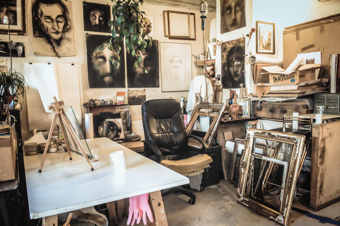
Riley runs a side hustle turning old event photos and sketches into posts, digital prints, and store cards. The team has one high-value rule: they do not start with a goal for one channel. They start with one clean source and one clear visual identity, then adapt the output to each destination.
This works because many creators make five versions of the same file too early. Each version gets a different crop, a different setting, and a different just-this-once edit. By the time release day arrives, no one remembers what the source even looked like.
The one-source strategy
Riley’s process begins with choosing one source file and locking composition first. For product-like assets, that means straight framing and consistent color. For art and portfolio work, it means selecting the sharpest representative shot, even if it is not the prettiest one. You can brighten and tone later, but you cannot invent a clean edge that does not exist.
How one image becomes five assets
Use case one: portfolio cover. Keep more context, less cropping, and a balanced aspect ratio so the image still feels honest.
Use case two: social thumbnail. Reframe tightly, increase perceived clarity, and prioritize immediate legibility of the central subject.
Use case three: product listing. Keep background simplicity, color consistency, and practical resolution for quick rendering.
Use case four: marketing story card. Build room for typography overlays in the layout, but keep the image file neutral enough to remain readable.
Use case five: print proof. Use the highest practical scale and keep sharpening low and restrained, then export at print-safe color and resolution settings.
Where Upscale fits
Riley uses Upscale once per branch, not for every branch. The team first checks if the source can support each destination. If a branch can be satisfied at 2x, they do 2x. If the branch genuinely needs extra space for a larger format, they test 3x, and only sometimes move to 4x for high-quality archive or print prep. This reduces waste and preserves consistency.
We want the same image personality, even if the canvas changes.
Mini case study from a weekly campaign
Last month, Riley had a campaign with one mural photo reused across four channels. The old process used four separate edits; the team spent half a day and still had uneven textures. After switching to one-source branching, they cut prep to under an hour and avoided the fake-look debate among team members.
Applying the workflow to three roles
The creator: starts with one visual statement, then branches to thumbnails, reels cover, and portfolio hero.
The small business owner: starts with one catalog shot, then branches to product grid, social post, and homepage banner.
The archive keeper: starts with one high-scan image, then branches to restoration preview and print proof.
Each role keeps the same source discipline. That creates consistency and makes team edits easier.
A weekly rhythm that avoids chaos
Riley uses a Friday setup: choose the main source by Wednesday, create source checks by Thursday morning, and finish branch outputs Friday afternoon. The branch outputs are then reviewed for consistency, not hero effect.
Three practical rules for reuse
Rule one: Keep at most one source version that can explain all branches. If you have five random source edits, you likely lost the original intent.
Rule two: Save branching rules in text before visual edits begin. Example: social branch keeps text space, print branch keeps color accuracy, store branch keeps edge stability.
Rule three: Use a final consistency pass before scheduling, not after. It is easier to move less.
This approach saves not only time but also trust. Your brand will feel coherent when the same subject looks like the same subject at every size.
Mini checklist before publish
Before sending to final:
- Use the same source audit for all branches.
- Test each size and check readability at normal viewing scale.
- Keep a final honesty pass: does each image still look like the same scene?
If the answer is yes, you are not only saving time. You are building a cleaner visual system that scales with your work. If the answer is no, stop and reroute the outlier branch before release.
The result is less stress, fewer revisions, and a portfolio or storefront where people recognize the same visual personality even across channels. No circus of unrelated filters, just a reliable workflow.
Mini bonus: a practical planning grid
Set one shared naming pattern for every batch: source version, branch, date, scale. Example: mural_src_main_v1, mural_social_2x_600w, mural_print_4x_2400w. Small detail, big payoff.
When your files carry meaning, your team edits with less guessing and more confidence. That is the quiet advantage of a disciplined workflow.
Final practical reminder
This workflow works because it converts taste into repeatable decisions. The next time another campaign arrives, your team already has a playbook instead of a guess. That means fewer frantic edits and more confidence that every published file still feels like the same brand voice.