From tiny thumbnail to client-ready artwork: a simple creator workflow
A practical creator workflow showing how to turn small images into polished outputs for portfolios, social, and client previews.
A freelancer once sent a 640-pixel logo draft and asked, Can we make this look decent for our client deck? The answer was yes, and here is how to avoid the usual mess.
Step 1: Decide the final goal. If it is a portfolio card, keep the target size small and readable. If it is a client mockup page, pick a bigger endpoint. Same source, different jobs, different outputs.
Step 2: Upscale with restraint. Do not jump to the top setting because bigger sounds better. Try 2x, then compare. For design work with cleaner lines, 2x often looks less artificial and easier to integrate.
Step 3: Preserve artistic intent. If a brush stroke has personality, do not over-sharpen. You want crispness, not stylized noise. In many cases, a slightly softer edge reads more believable than over-processed detail.
Step 4: Export in layered variants. Keep one high-fidelity file for hero use and one lighter file for social previews. The same artwork can fit different channels without repeated edits.
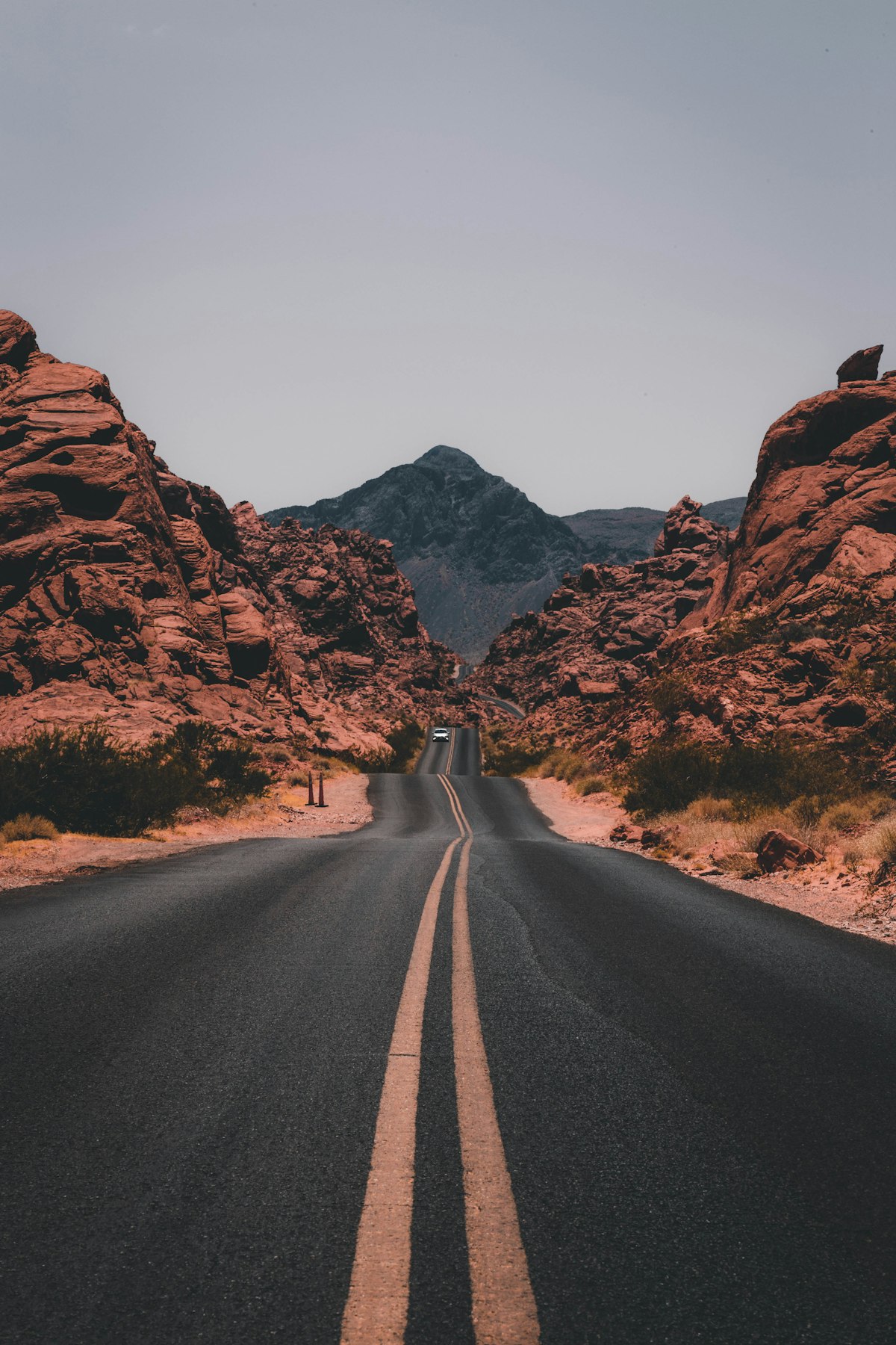
Step 5: Let the image breathe. Avoid squeezing everything into giant frames with little margin. A tiny source can become huge and still feel cramped if placed poorly.
This workflow also helps team handoffs. Instead of sending one giant file and requesting endless revisions, send one small-use version, one social-use version, and one print-safe version. The client can choose quickly, and file confusion drops.
One practical lesson from this case: your workflow can be your quality bar. If you build habits for prep, scaling, and export, your output feels professional even when the starting point is imperfect.
And there is a bit of joy in it too. Nothing feels better than hearing this looks intentional, instead of what happened to this tiny thumbnail.
So keep the process lightweight, keep the intent clear, and let the model do what it is best at: improving clarity where real detail exists.
For creators with many assets, keep a simple naming rule: source, trial, final. That alone reduces nervous re-uploading and gives you a fallback when a client asks for one alternate version later. A calm naming system is underrated and oddly creative-friendly.
The workflow still has room for delight. When you are done with five clean steps, take one version and run the same file through one alternate scale, then compare. The side-by-side difference teaches your team and your future self what works. Good visual systems grow from repetitive, calm habits, not from one perfect upload.
Final check before sharing with a client: view the final version on a bright phone screen and a desktop. If one looks good and the other looks soft or over-edgy, create a second export and match the worst-case viewer. Clients usually compare by eye in the least flattering light, so that extra pass matters.